The Problem
Since its establishment in 2010, the SSI has undergone multiple iterations. In preparation for its fourth funding phase, the Institute chose to update its branding to better match its matured position in the field. The challenge was to evolve a long-standing visual identity that had symbolised early ambition into a brand system that reflected a more refined focus and professional integrity, while still maintaining the essence of its well-known original visual identity.
The Solution
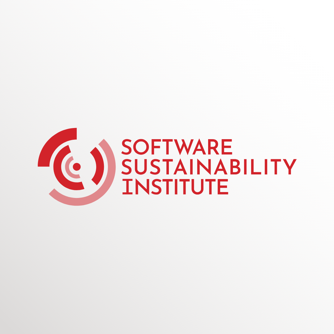
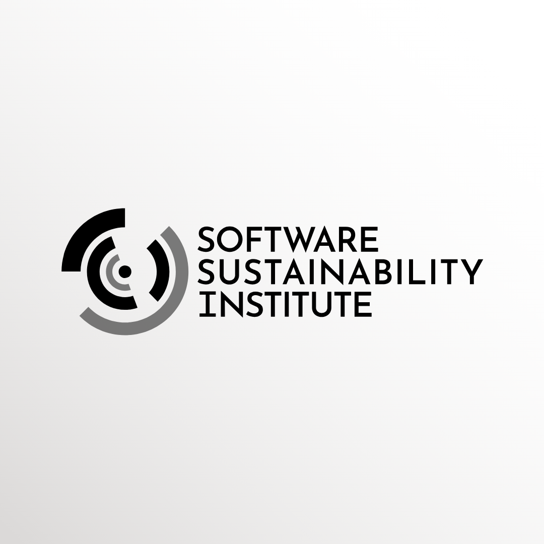
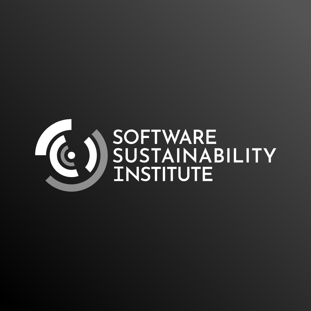
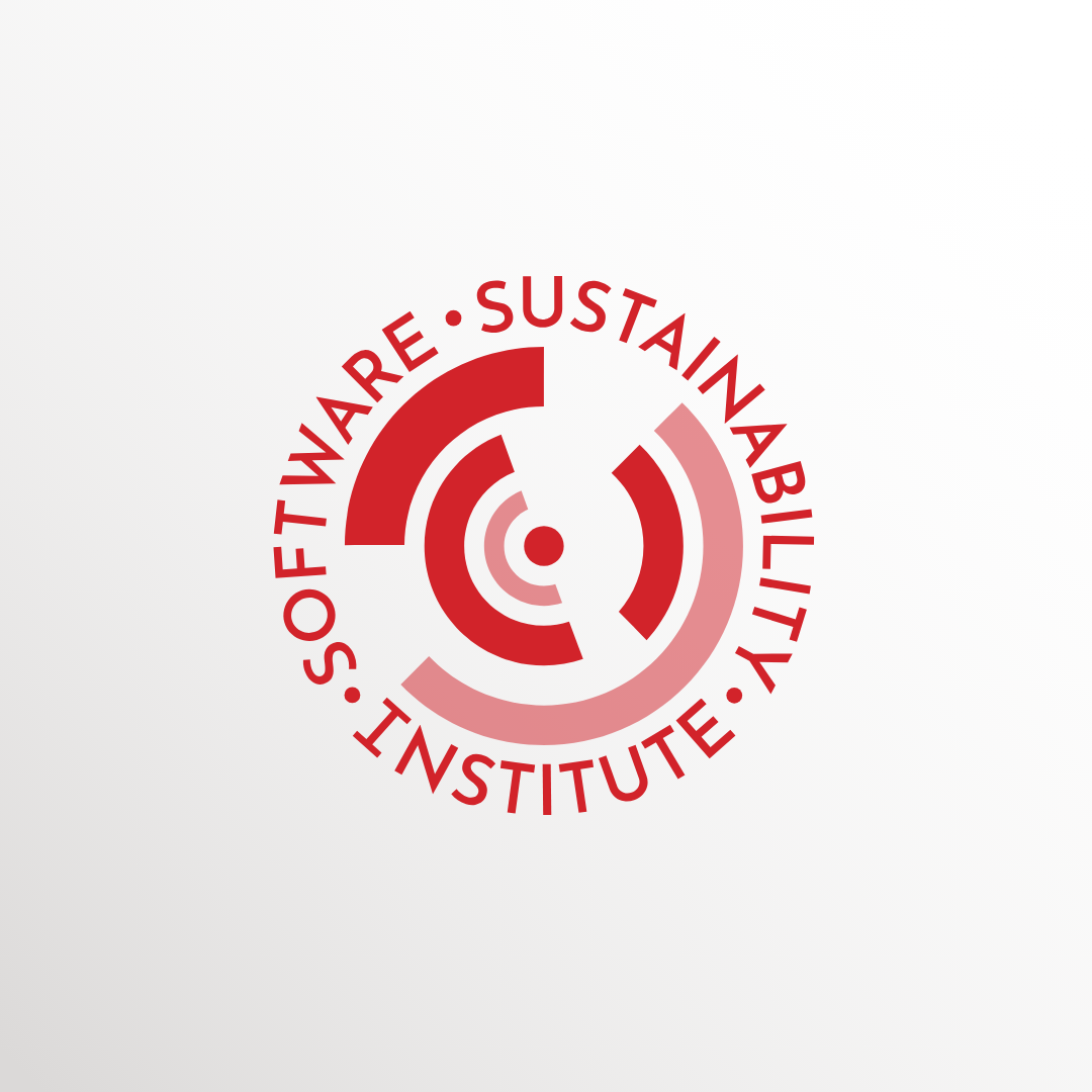
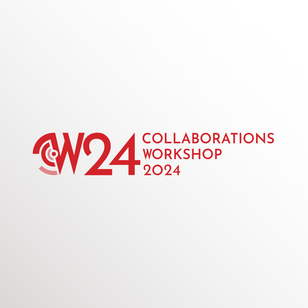
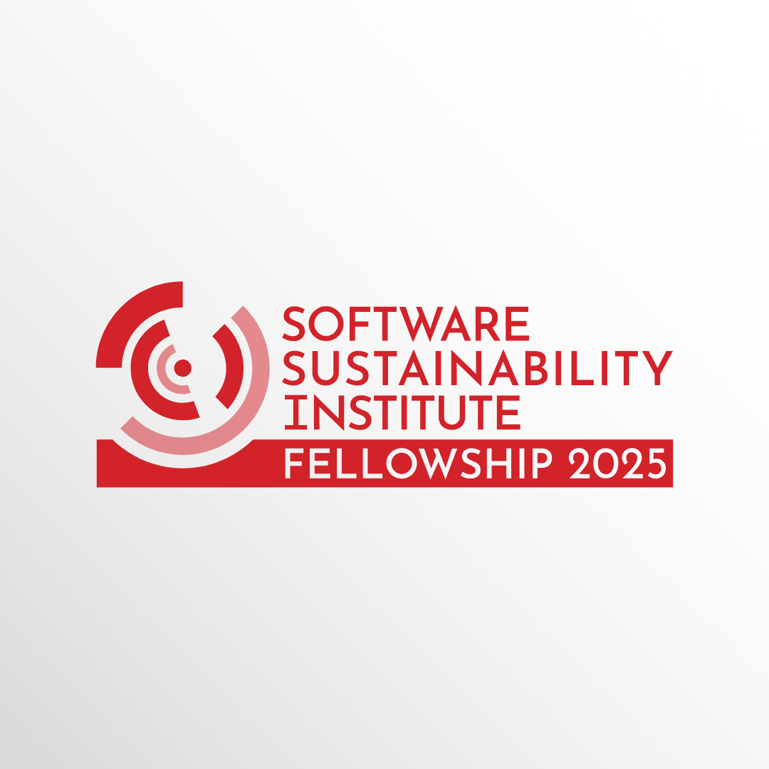
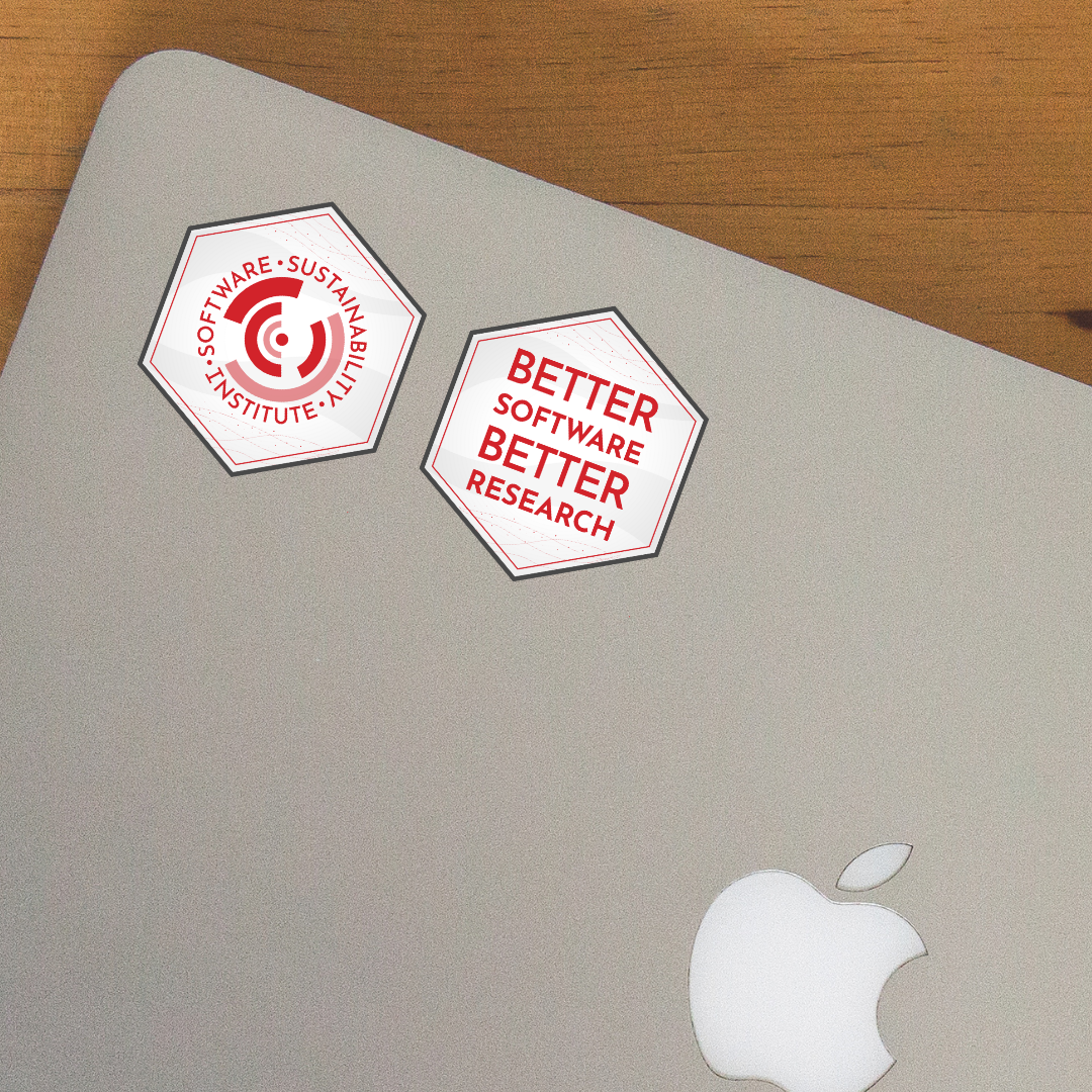
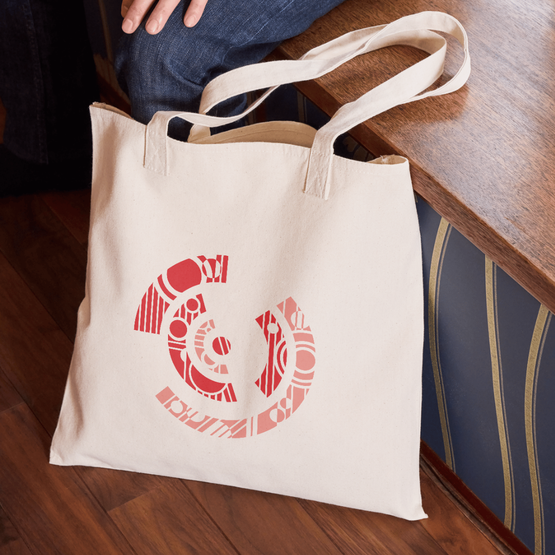
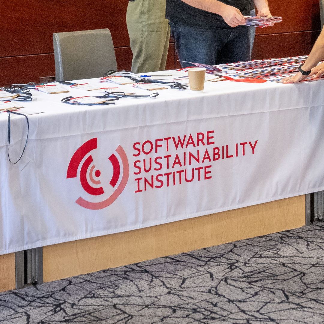
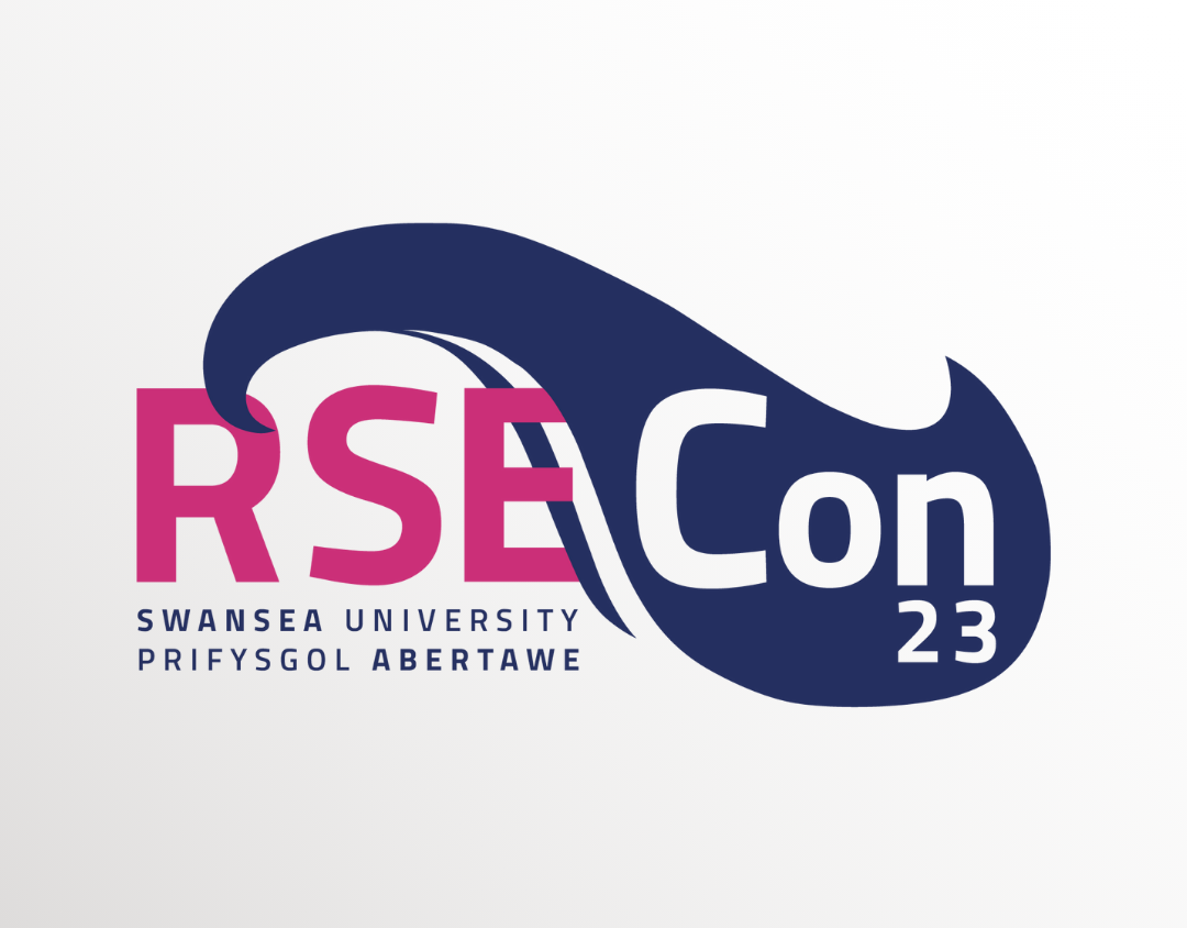
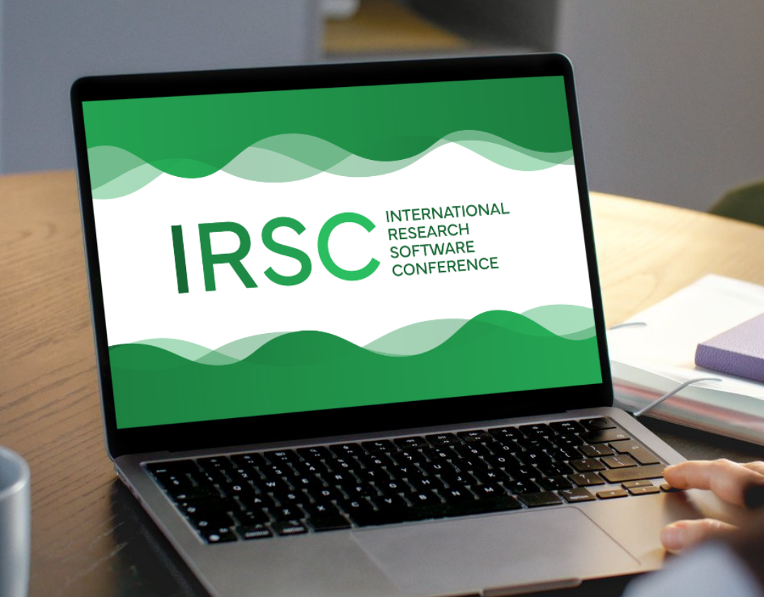
The redesign builds on the SSI’s foundation by modernising the original logo into a sharp, flat, monochrome mark that focuses the circular motif around a central point. While the iconic red remains to symbolise strength and confidence, it is now used strategically for the logo and subtle highlights against neutral backgrounds to convey a more balanced, modern approach. This consistency extends to associated event logos, such as CW and RSC, which borrow from the SSI icon to maintain individuality while strengthening the overall brand system through bold, confident typography.