The Problem
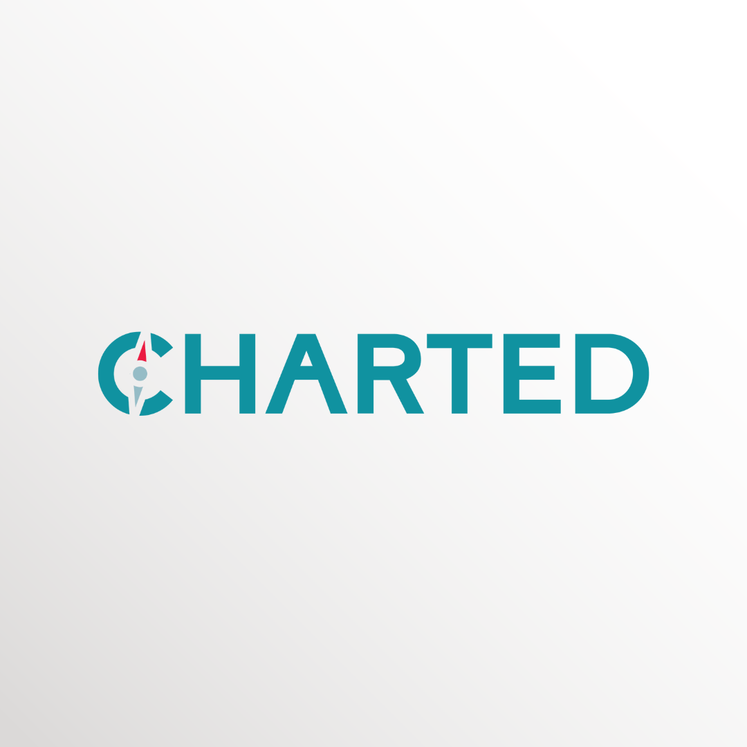
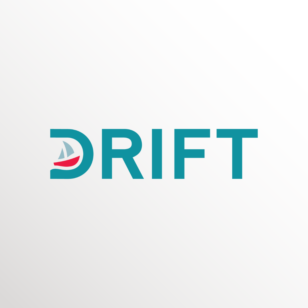
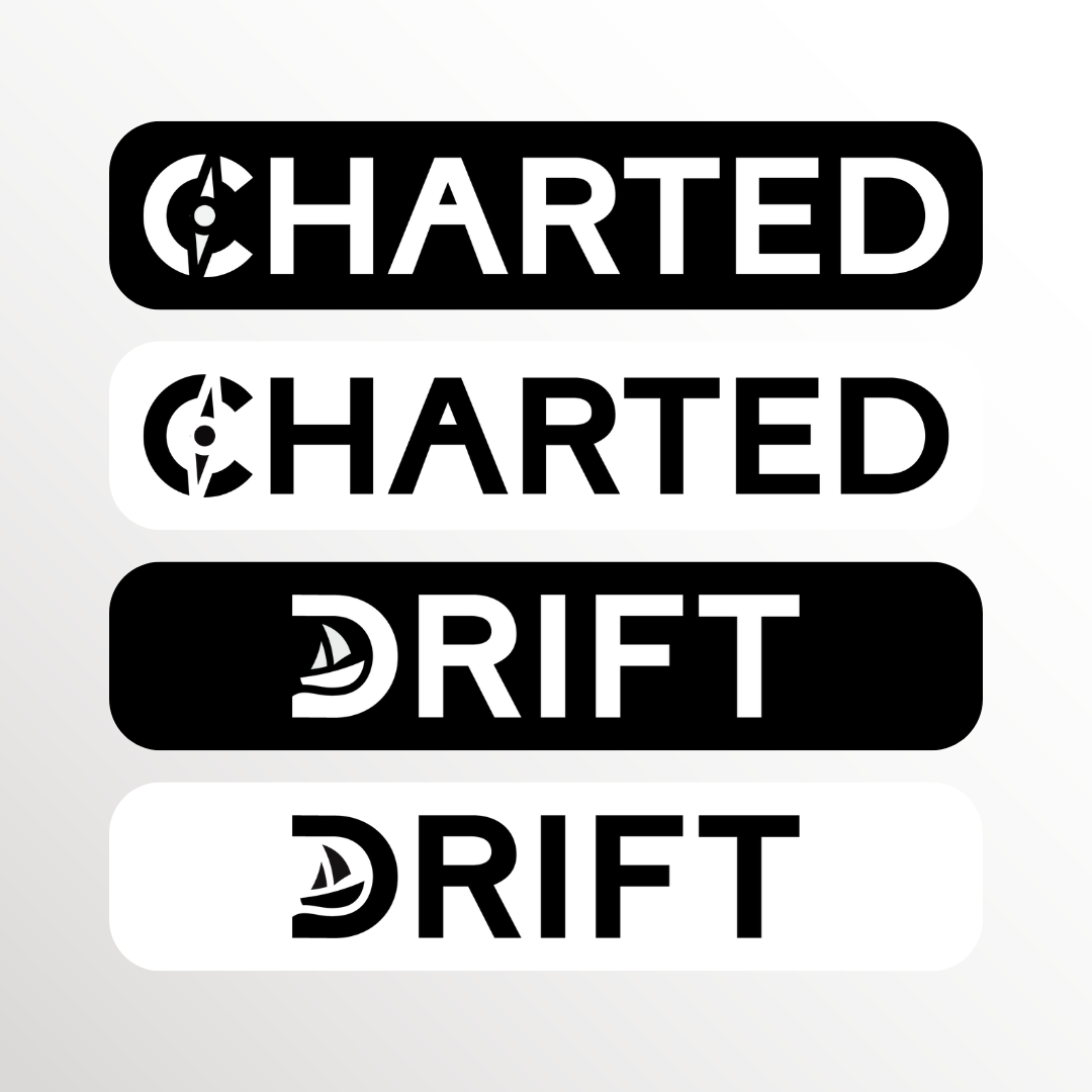
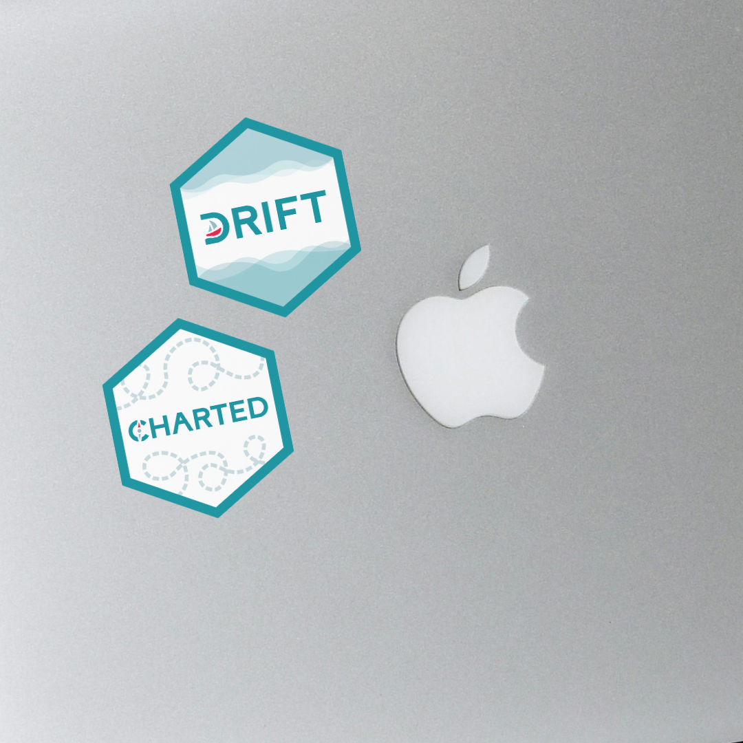
The challenge was to create distinct visual identities for the CHARTED and DRIFT projects that clearly signaled their connection to the existing UNIVERSE-HPC brand. The team required a system that felt like part of a unified family while giving each project a unique character. The branding needed to be highly adaptable, moving from digital applications to physical promotional merchandise like traditional hex stickers to support their outreach and visibility goals.
The Solution
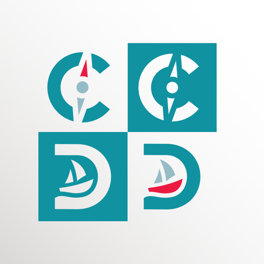
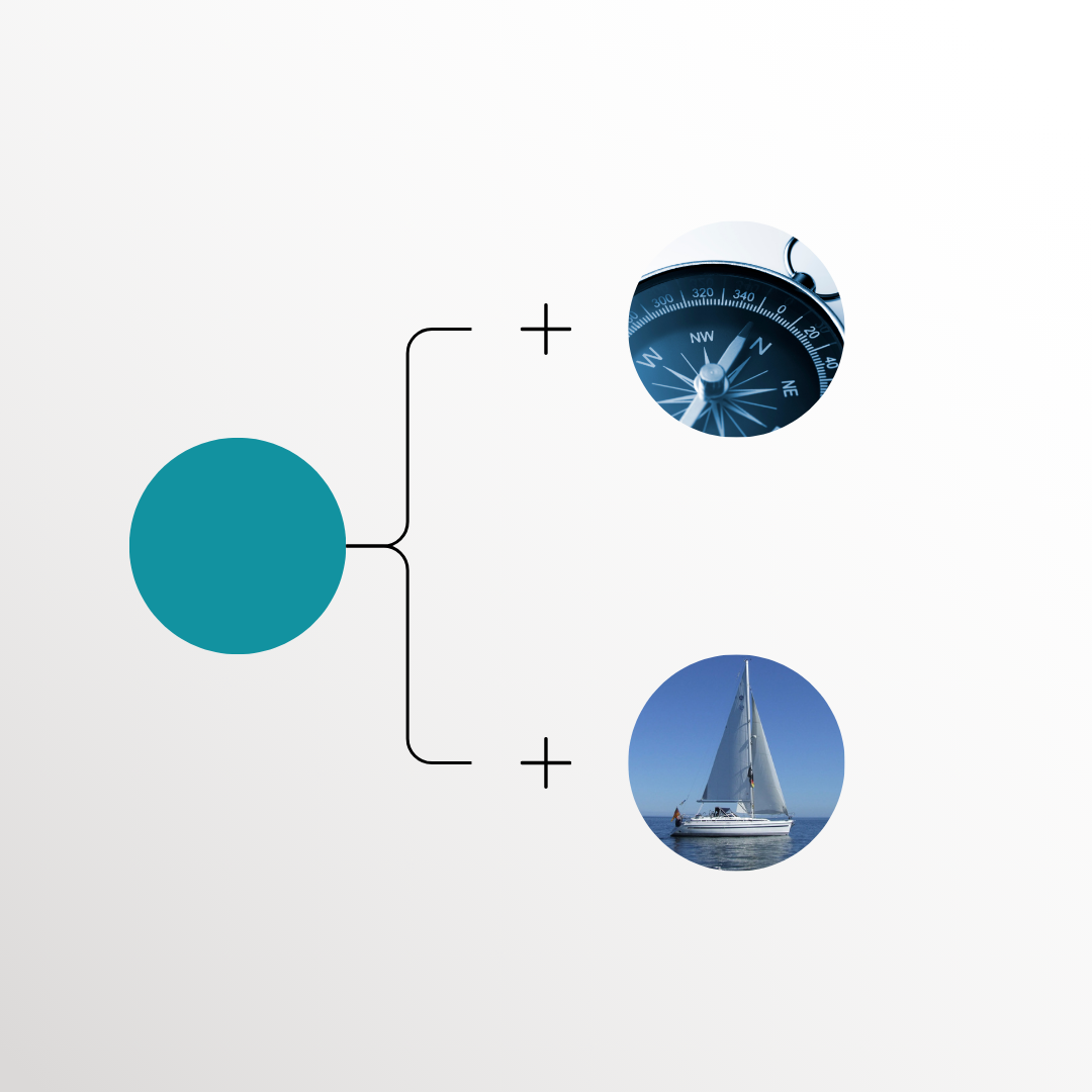
Drawing on the projects' acronyms, I developed compass and boat themes to serve as symbolic anchors for their individual identities. To ensure continuity, I carried over the teal from UNIVERSE-HPC, while introducing a bold red accent to add contrast and vibrancy to the palette. This dual-colour approach allowed both projects to maintain a professional link to the parent identity while standing out on their own. I then applied this branding to custom hex stickers and flyers, providing the team with versatile merchandise for promotion and community engagement.