The Problem
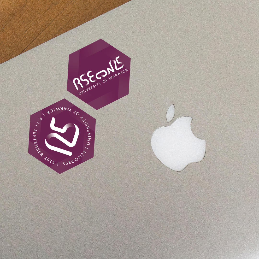
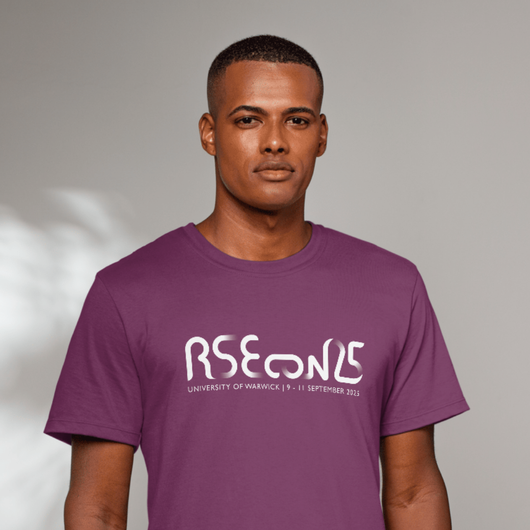
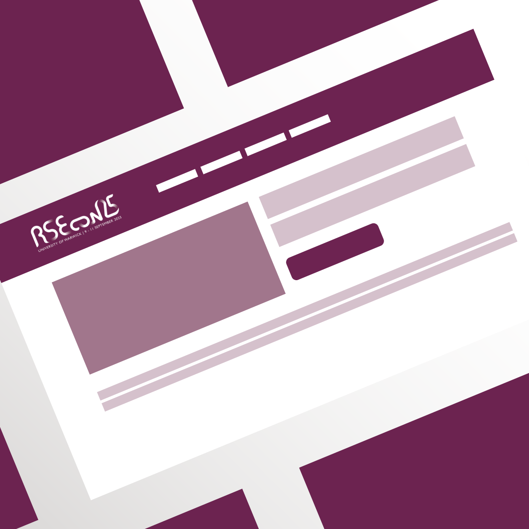
The commission for RSECon25 required a central visual identity that could anchor the conference’s digital presence while translating effectively onto physical merchandise. The challenge was to create a logo that not only worked across the event website but also looked high-impact on items like stickers and t-shirts. Beyond the technical requirements, the design needed to represent the core values of the Research Software Engineering community, specifically the ideas of continuity and the professional connections that drive the annual event.
The Solution
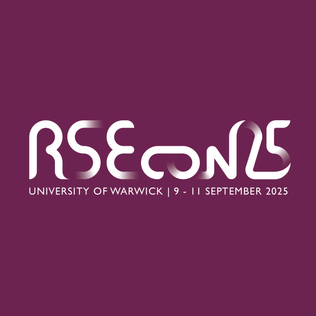
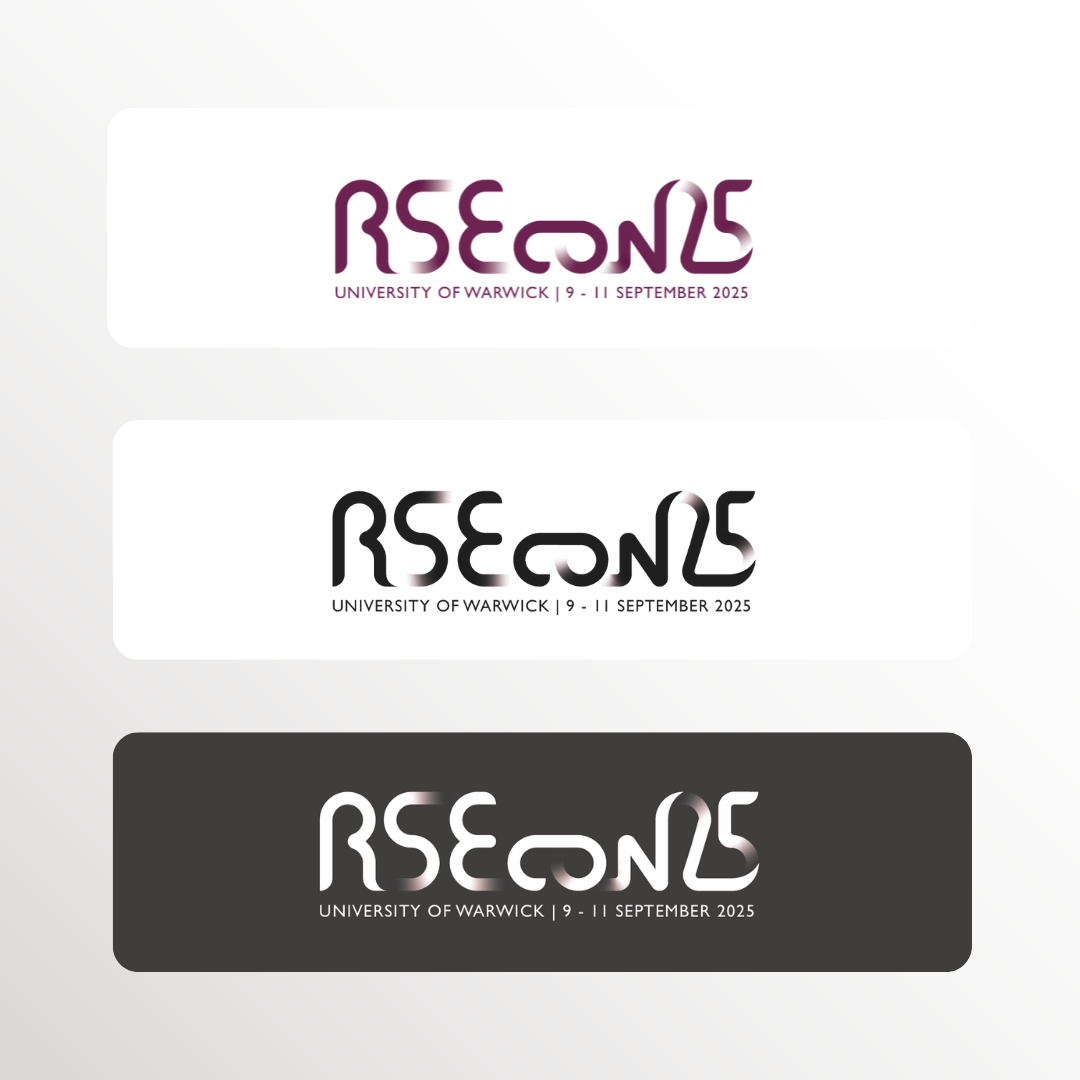
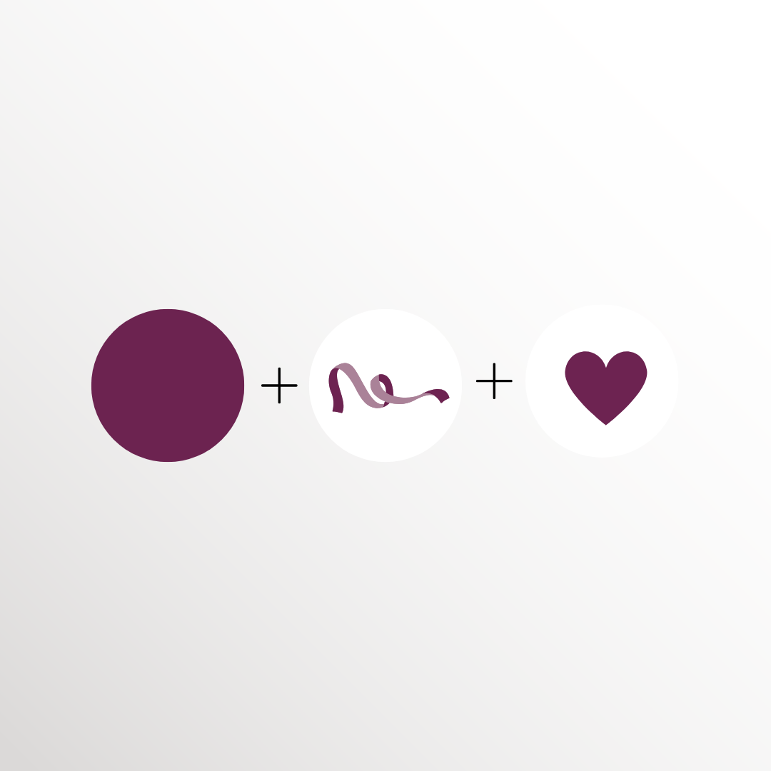
I designed a logo that utilises purple as the primary colour to maintain a direct association with the Society of Research Software Engineering. The central motif of a ribbon was developed to signify the continuity and connections that are at the core of the conference, providing a meaningful and recognisable symbol for the community. This design was optimised for versatility, ensuring a bold and cohesive look across the website and all promotional merch, including t-shirts and stickers, to help build a sense of shared identity among the attendees.