The Problem
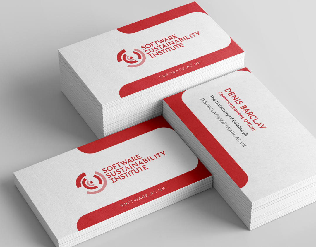
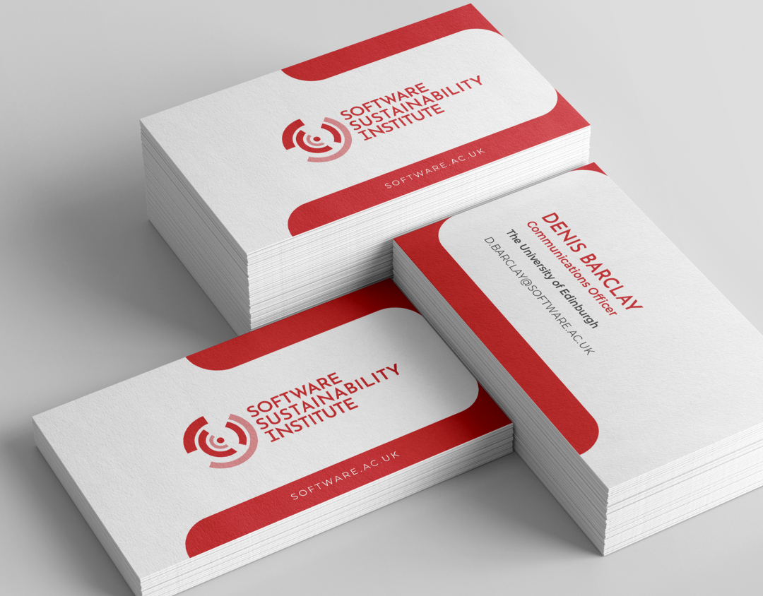
Research into staff, fellow, funder, and advisory board perceptions surfaced a clear gap: the Institute's reputation had outgrown its identity. The existing logo did not reflect the organisation anymore.
Red, a strong and recognisable brand asset, was being used so heavily that it read as overwhelming rather than confident. And the Institute's own initiatives, several of them well known in their field, weren't being visibly credited back to the organisation that created them.
A new identity needed to resolve all three: give the mark real meaning, bring discipline to a colour people already associated with the brand, and build a system that could carry attribution consistently across every programme.
The Solution
I designed the Institute's new visual identity to answer that research directly. A five-colour palette keeps the red that people already recognise, but gives it a defined, disciplined role rather than saturating every surface.
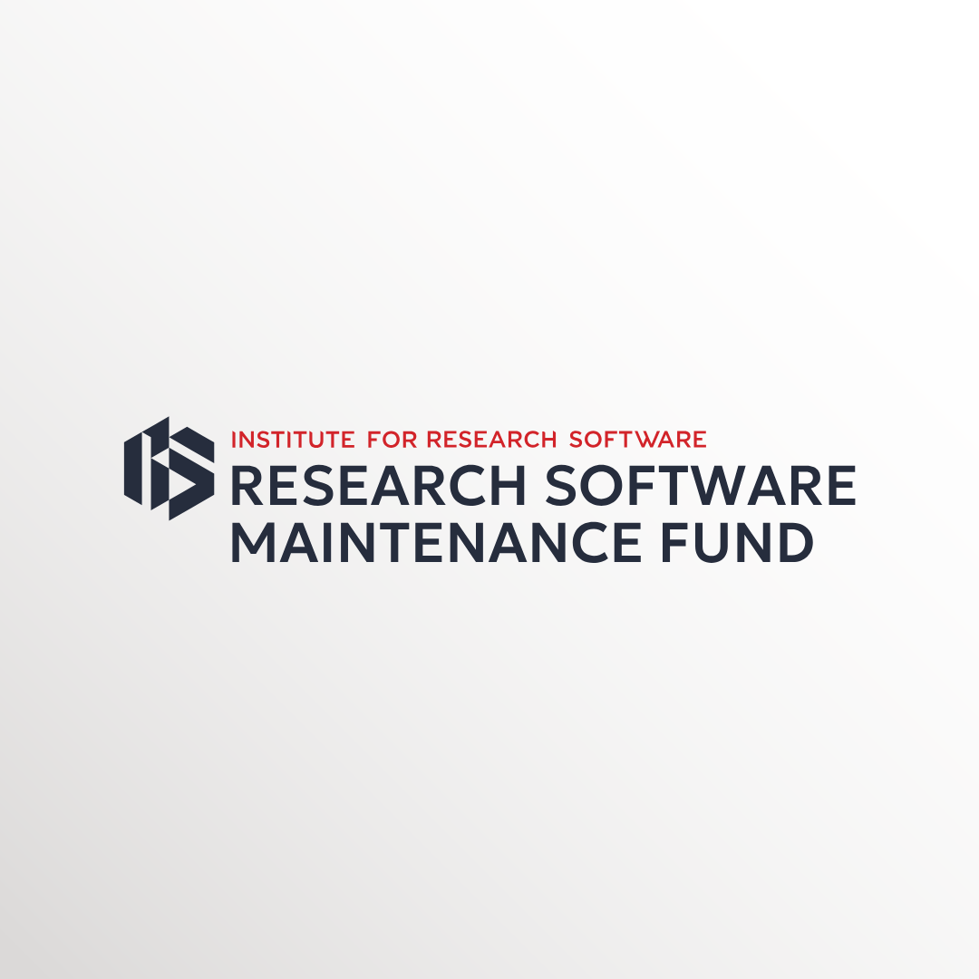
The new hexagonal logo mark, built around an RS monogram, replaces the old abstract circular icon with something that signals what the Institute stands for.
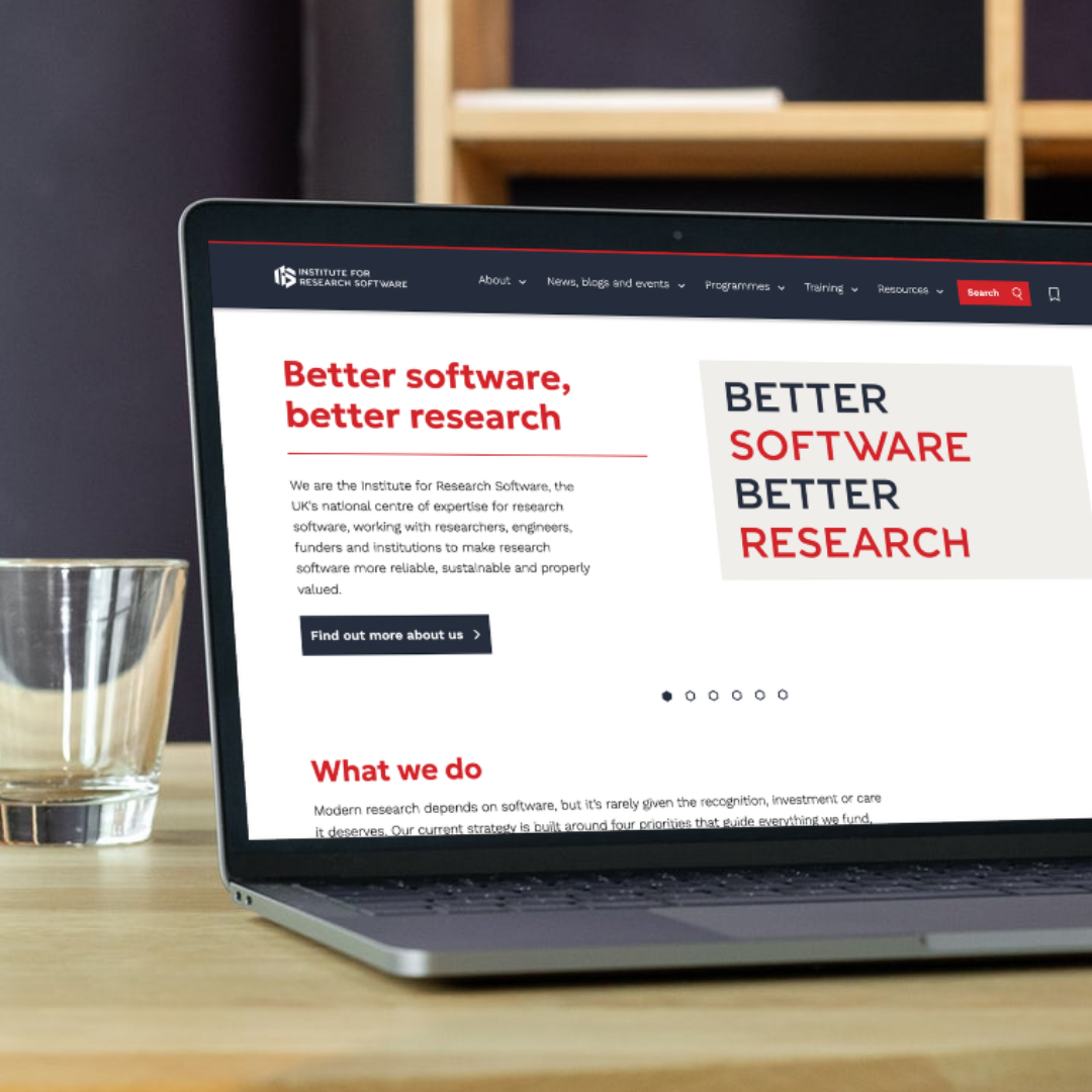
From there I built out a full set of brand guidelines and digital assets, including a consistent endorsement system so every programme and initiative carries visible attribution back to the Institute, and applied the identity across the website and a staff-facing brand launch presentation.